|
|
This page was last modified 2024-01-21
| |||||||||||||||||||||||||||||||||||||||||||
This page was automatically generated by plot_from.py
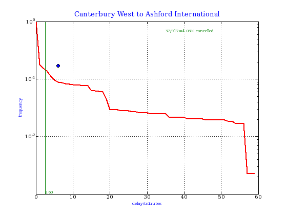
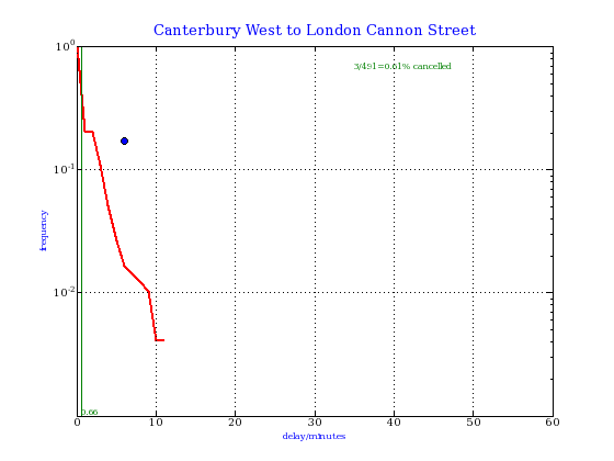
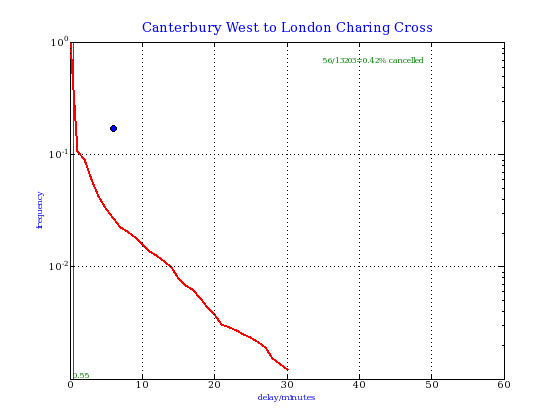
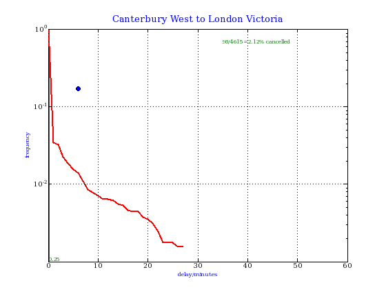
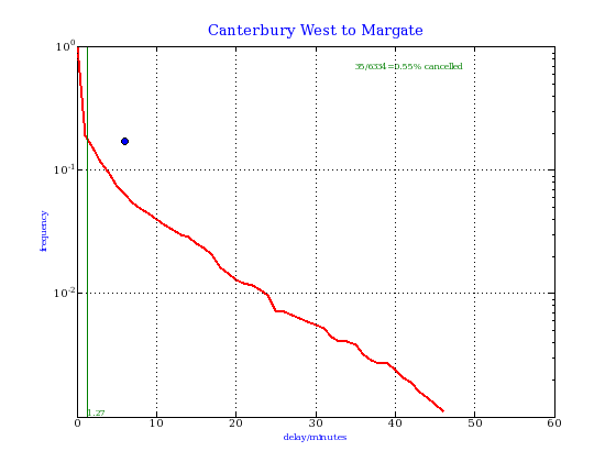
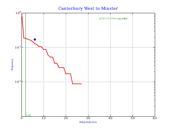
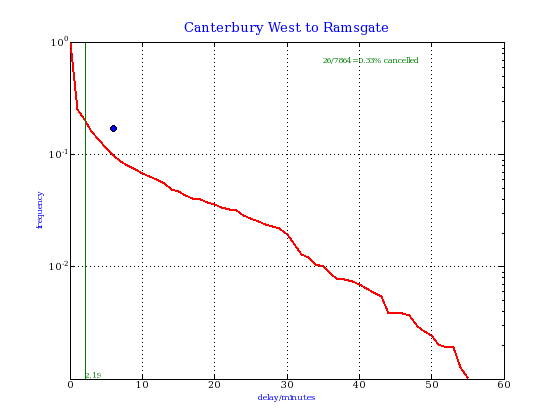
Canterbury West train performance data2005 Nov 16 to 2007 May 29 This data is obtained automatically from here. The data is actual delay from scheduled departure time, in minutes. cumulative distributionsThese plots allow a prediction of the probability (on the vertical axis) of departing d minutes or more late. The blue circle represents the target of 82.8% of trains departing within 5 minutes of schedule; that is, less than 17.2% delayed 6 or more minutes. If the red curve is under the blue circle, the target is met. The green vertical line denotes the average delay. Cancelled trains are ignored in these plots.
|
 This website uses no cookies. This page was last modified 2024-01-21 10:57
by
This website uses no cookies. This page was last modified 2024-01-21 10:57
by